2019 January–March
Internal platform changes that are not visible to capsule developers will be communicated via internal status updates.
19E Capsule SDK Release Notes
Updated: March 28, 2019
New Audio Player Library Capsule
To allow your capsule to play audio streams within Bixby, we've introduced the bixby.audioPlayer library capsule, which can play any audio format and codec supported by Android.
Read more about how to use the audio player library through the accompanying example.audio sample capsule.
Enhancements to Bixby Views
You can now use for-each loops with Bixby Views components within compound-card, layout, layout-match.
Additionally, we've simplified the structure for text, paragraph, and image.
For example, here's the old and new way to specify text:
Old text:
single-line {
  text {
    value ("#{value(myType)}")
  }
}
New text
single-line {
  text ("#{value(myType)}")
}
or
single-line: text ("#{value(myType)}")Both the old and new ways to specify these structures are supported.
New Runtime Flags
To help you control behavioral changes that we will make to the Capsule SDK runtime, we've introduced runtime flags.
As we change runtime behavior and possibly deprecate undesired behavior, we'll ask you to explicitly adopt the new behavior and make corresponding changes to your capsule.
Change to form-prompt
To better reflect that form-prompt is a feature of action, we've moved it to within the features sub-key of action.
Deprecation Stages
Learn more about the deprecation stages.
- Stage 1: R19O
- Stage 2: R19O
- End of Life: R19U
19D Capsule SDK Release Notes
Updated: March 14, 2019
New Config & Secrets Tab
You now have a new, secure way to store secrets using the new Configuration & Secrets tab on the Bixby Developer Center.
Additionally, you can use this new feature to store configuration properties that need to be updated in real time.
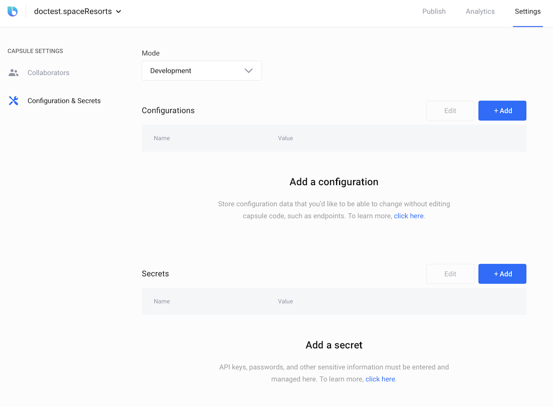
Secrets consist of sensitive information that should not be stored in code and might need to be updated frequently (such as API keys and authentication details). You can register these in the secrets section of the Developer Center and they will be securely encrypted end-to-end. Secrets even appear obfuscated in the UI (example: *********dg3) and can be updated at any time. In your capsule code, you can access secrets with the new secret.get() JavaScript method.
For non-sensitive information, you should continue to define capsule properties in the /resources/base/capsule.properties file, which makes them accessible via the config.get() JavaScript method. Within Configuration & Secrets, you can now dynamically override the values for these properties without changing your capsule code. Examples of such dynamic configurations include endpoint URIs, permission scopes, feature gates, or any other non-sensitive configuration data that you'd like to be able to change without editing capsule code. Simply define capsule properties with the same names in the Developer Center and set new values that will flow through to the config.get() JavaScript method.
Note that we're deprecating support for the redundant resources/<target>/capsule.properties files. Instead, you should consolidate your properties into a single resources/base/capsule.properties file. You can still apply different configurations per target device or locale using $vivContext.device and $vivContext.locale in JavaScript. For an example of how to migrate to using a single capsule.properties file using $vivContext.locale, refer to a corresponding update to the Space Resorts sample capsule.
Read more about using the Configuration & Secrets tab.
Deprecation Stages
Learn more about the deprecation stages.
- Stage 1: R19O
- Stage 2: R19O
- End of Life: R19U
Sort Signals Deprecated
We've deprecated sort signals.
You should now apply sorting to your actions or sort-orderings within structure concepts.
You also should remove any sort signals within training.
Changes to OAuth Redirect URI
If you implement OAuth in your capsule actions, the redirect URI now must include the capsule ID:
Old:
https://oauth.aibixby.com/auth/external/cb
New:
https://<encoded capsule id>.oauth.aibixby.com/auth/external/cb
The <encoded capsule id> is your capsule ID where the . character is replaced with -. For example, if your capsule is viv.dice, the redirect URI would be:
https://viv-dice.oauth.aibixby.com/auth/external/cb
Do not register https://*.oauth.aibixby.com/auth/external/cb using a wildcard (if your content provider supports it) as it poses a security risk to your users. Doing so allows other capsules to take over access to your users' accounts.
Read more about OAuth redirects in JavaScript actions.
Pattern Support for text-input Components
Within Bixby Views, we now support specific patterns within text-input: email, mask, and regex.
Old:
text-input {
  ...
  pattern-type (email)
}
New:
text-input {
  ...
  pattern {
    email {
      on-error ("Input a valid email address")
    }
  }
}
Old:
text-input {
  ...
  mask ("(100)-0000")
  guide (true)
  placeholder-char (_)
}
New:
text-input {
  ...
  pattern {
    mask ("(100)-0000") {
      guide (true)
      placeholder-char (_)
    }
  }
}
As a result, we've deprecated the following text-input sub-keys that are now available within the new pattern key:
guidemaskpattern-typeplaceholder-char
Support for for-each conditionals within vbox
Within Bixby Views, the vbox key now supports for-each conditionals.
...
        hbox {
          content {
            vbox {
              content {
                for-each (weather.hourly) {
                  as (hour) {
                    single-line {
                      text {
                        value {
                          template ("#{dateTime(hour.when,'h')}")
                        }
                        style (Detail_L)
                      }
                    }
                  }
                }
              }
            }
            vbox {
              content {
                for-each (weather.hourly) {
                  as (hour) {
                    single-line {
                      image {
                        url {
                          template ("[#{value (hour.icon.url)}]")
                        }
                        style (Title_M)
                      }
                    }
                  }
                }
              }
            }
          }
        }
...
New grow key within vbox
Within Bixby Views, you can now control the width of vbox columns using the grow key, which is similar to the behavior of the CSS flex-grow property.
...
            hbox {
              content {
                vbox {
                  grow (2)
                  content {
                    single-line: text: value (business)
                    single-line: image { url ("Business.png") style (Label_M) }
                  }
                }
              }
            }
...
<span data-stage-"internal">
Continuation Categories
Capsules can now be assigned to categories in the Marketplace based on their function, such as Radio, News, and Podcast. When your capsule is assigned to one or more categories, users can specify your capsule as a default for Bixby to use with that category. You can then associate actions and concepts in your capsule that are associated with continuations for that category.
action (FindSong) {
  output (Song)
  ...
  features {
    continuation-category (Radio)
  }
}
Read more about continuation categories.
19C Capsule SDK Release Notes
Updated: Feb 25, 2019
Bixby Views Updates
The following changes have been made to Bixby Views.
New aspect-ratio key, Deprecated size
The size key in cards and images is now deprecated. Use the new aspect-ratio key to specify how an image or a card fits in a Bixby View.
Old:
image-card {
  size (L)
  ...
}
New:
image-card {
  aspect-ratio (4:3)
  ...
}
Deprecated layout-match in selection-of and list-of
The layout-match key is deprecated in selection-of, list-of, and their respective highlights keys. Instead, use a layout-macro or create the content within those keys directly.
Old:
result-view {
  match: SpaceResort (result)
  render {
    if (size(result) > 1) {
      list-of (result) {
        where-each (item) {
          layout-match (item) {
            mode (Summary)
          }
        }
      }
    } else-if (size(result) == 1) {
      layout {
        layout-match (result) {
          mode (Details)
        }
      }
    }
  }
}
New:
result-view {
  match: SpaceResort (result)
  render {
    if (size(result) > 1) {
      list-of (result) {
        where-each (item) {
          layout-macro (space-resort-summary) {
            param (spaceResort){
              expression (item)
            }
          }
        }
      }
    } else-if (size(result) == 1) {
      layout {
        layout-macro (space-resort-details) {
          param (spaceResort) {
            expression (result)
          }
        }
      }
    }
  }
}
New text-position Key for Titles
The text-position key enables you to choose if an image is below or above the title area of an image card.
image-card {
  aspect-ratio (16:9)
  text-position (Below)
  ...
}
You can choose between Below and Overlay.
New Legal Text Style
The Legal text style was added so you can define legal content in a View.
text {
  value (Sample Text)
  style (Legal)
}
Allowed JavaScript Date Object
You can now use the built-in JavaScript Date object to perform date and time calculations internally in your functions. If you do use the built-in JavaScript Date, you need to manually convert these to the appropriate viv.time objects when returning those results.
New Keys for capsule-info.bxb File
The following keys were added for the capsule-info.bxb file:
privacy-policy-urlsearch-keywords
New Reserved Utterances
Certain utterances are now reserved for specific situations. For more information, see Reserved Utterances.
Required Declaration of Modules in Local JavaScript
If you are using one of our provided JavaScript APIs, you must explicitly declare it in your JavaScript file.
var http = require('http')19B Capsule SDK Release Notes
Updated: Feb 12, 2019
Deprecated Labels in Bixby Views
Within Bixby Views, we've deprecated the following text style labels:
Label_MLabel_M_SoftLabel_LLabel_L_Soft
New Requirement for Time within Transaction Flows
If you have transactional workflows within your capsule, and if you are using the time key within activity, such as within structures, you must now ensure it is of type or subtype BaseDate or BaseDateTime.
Change in Ordinal Selection Pattern
If you're using ordinal selection patterns as part of hands-free list navigation, be aware that we've renamed the viv.core.SelectionOrdinal pattern label to viv.core.OrdinalSelector.
Old
 ordinal-selection-patterns {
    pattern ("(first)[v:viv.core.SelectionOrdinal:1]")
    pattern ("(first)[v:viv.core.SelectionOrdinal:1] one")
    pattern ("that (first)[v:viv.core.SelectionOrdinal:1] one")

    pattern ("yes (first)[v:viv.core.SelectionOrdinal:1]")
    pattern ("yes (first)[v:viv.core.SelectionOrdinal:1] one")
    pattern ("yes that (first)[v:viv.core.SelectionOrdinal:1] one")
}
New
 ordinal-selection-patterns {
    pattern ("(first)[v:viv.core.OrdinalSelector]")
    pattern ("(first)[v:viv.core.OrdinalSelector] one")
    pattern ("that (first)[v:viv.core.OrdinalSelector] one")

    pattern ("yes (first)[v:viv.core.OrdinalSelector]")
    pattern ("yes (first)[v:viv.core.OrdinalSelector] one")
    pattern ("yes that (first)[v:viv.core.OrdinalSelector] one")

    pattern ("result number (one)[v:viv.core.CardinalSelector:1]")
}
You can alternatively use the viv.core.CardinalSelector label to indicate a numbered result and its value, as shown in the example above.
19A Capsule SDK Release Notes
Updated: January 30, 2019
New OAuth 'authorization.bxb' File
We've updated the way in which you configure OAuth authorization. You must now use an authorization.bxb file that defines the OAuth 2.0 access scope a user can give a provider:
authorization {
  user {
    oauth2-authorization-code (providerId) {
      authorize-endpoint (...)
      client-id (...)
      client-secret (...)
      scope (...) // optional
      token-endpoint (...)
      revoke-endpoint(...) // optional
      login-button-label(...) // optional
    }
  }
  global {
    oauth2-client-credentials (providerId) {
      client-id (...)
      client-secret (...)
      scope (...) // optional
      token-endpoint (...)
    }
  }
}
In the previous method that is now deprecated, you specified OAuth authorization through your endpoints declaration (endpoints.bxb). You could specify exactly one type of authorization, which is automatically applied to all endpoints. If some of your endpoints required a different authorization, you could overwrite it using authorization-override.
With the authorization.bxb file, you can specify one user scoped authorization (currently oauth2-authorization-code) and one globally scoped authorization (currently oauth2-client-credentials). You no longer need to explicitly use authorization-override.
You must place the authorization.bxb file within the capsule root folder, not within the resources folder.
No authorization is applied to an endpoint automatically. An endpoint that needs authorization needs to be tagged with authorization (User) or authorization (Global) depending on which authorizations are needed:
endpoints {
  action-endpoints {
    action-endpoint (OAuthUser) {
      remote-endpoint (https://example.com) {
        method (GET)
      }
      authorization (User)
    }

    action-endpoint (OAuthGlobal) {
      remote-endpoint (https://global.example.com) {
        method (GET)
      }
      authorization (Global)
    }
    action-endpoint (OAuthNone) {
      remote-endpoint (https://internal.example.com) {
        method (GET)
      }
    }
  }
}
Read more about Authorizing Access with OAuth.
Deprecation Stages
Learn more about the deprecation stages.
- Stage 1: R19O
- Stage 2: R19O
- End of Life: R19U
Custom OAuth Grant Types
You can now use a custom grant type when using OAuth in your capsule. The oauth2-custom key is helpful when your service does not use standard grants provided with OAuth 2.0.
authorization {
  user {
    oauth2-custom (providerId) {
      authorize-endpoint (...) //optional
      client-id (...)
      client-secret-key (...)
      grant-type (...)
      login-button-label (...) //optional
      revoke-endpoint (...) //optional
      scope (...)
      token-endpoint (...)
    }
  }
  global {
    ...
  }
}
Conditionals for Minimum Cardinality Inputs
When declaring required inputs, you can now specify an on-empty block and use conditionals to either prompt the user or halt execution:
input (myInput) {
  type (MyType)
  min (Required) {
    on-empty {
      if (condition) {
        prompt | halt
      }
    }
  }
}
Bixby Views Support for 'payment-selection'
Bixby Views now supports the new payment-selection component in cases where you need to confirm a transaction or verify a payment from users.

This new component creates a payment UI for users so that they can complete a transaction.
18X Capsule SDK Release Notes
Updated: January 15, 2019
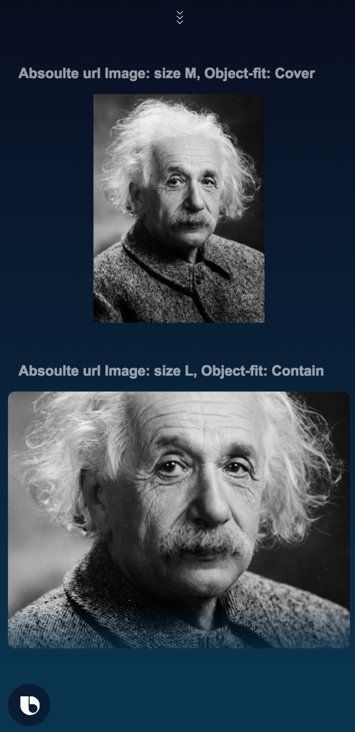
Bixby Views Support for 'image'
Bixby Views now supports the new image component in cases where you want to include a standalone image within a compound card or section within a content container.
You can specify the image URL, optionally the size, and whether an image should be cropped.