
Design Considerations for Flexible UX
Current Bixby mobile devices use Flexible UX, a lighter, more compact user experience for Bixby consistent with the general Samsung OneUI design. For example, cell cards in a list are collapsed into a single focus block separated by a line instead of using spaced out cards, while highlights are still separated from the main list. The following table shows an example of an input view with a regular Bixby View and with Flexible UX.
| Regular Bixby View | With Flexible UX |
|---|---|
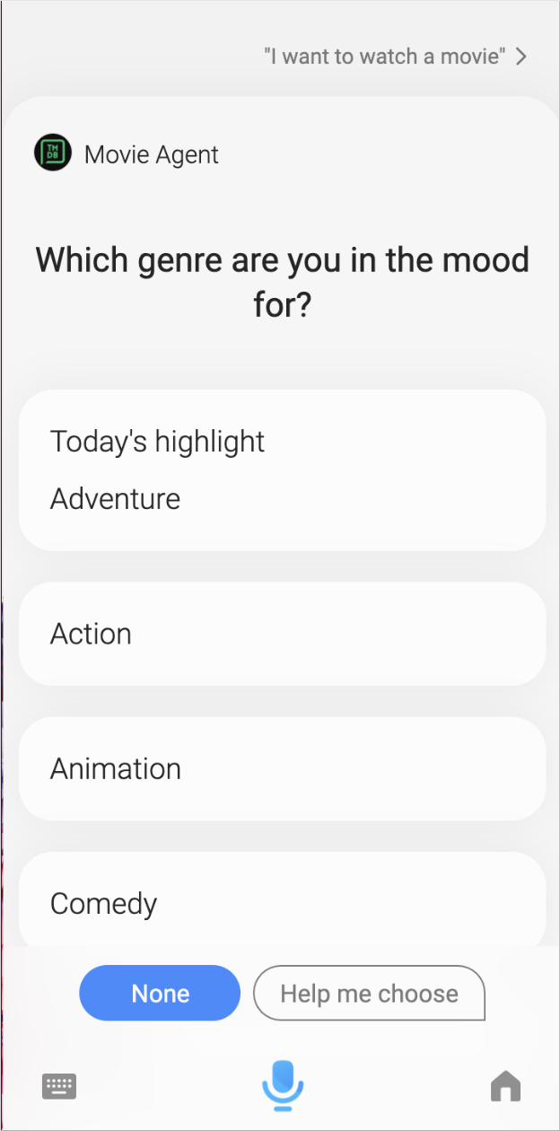 |  |
This document outlines some design considerations and additional recommendations for creating Bixby Views with Flexible UX, the standard on Bixby-enabled mobile devices.
For more information on how the Bixby Views components will display, you can reference the interactive demo on each of their reference pages. Additionally, you can test your capsule in the Device Simulator or try on-device testing.
General Considerations
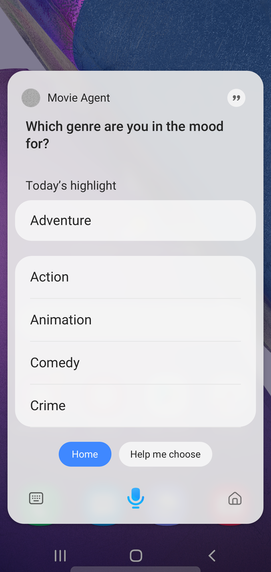
One of the advantages of Flexible UX is that it enables users to quickly switch between Bixby and other tasks on their device, meaning Bixby doesn't fully block the user's main screen. This is especially useful if users are between tasks. However, this UI change means you might need to tweak older existing designs to better fit the Flexible UX interface.
For example, Flexible UX has a more compact design than the original Bixby Views, no longer taking up the entire screen:
While Bixby will automatically modify most components to fit neatly in the Bixby Views area, you might want to consider scaling down any larger items, such as higher resolution images.
Additionally, Flexible UX is a voice-forward design, so avoid using components that require touch when possible. This allows the user to continue the conversation with continuation utterances, and allows Bixby to be available through voice across multiple devices.
Examples and Recommendations
These examples and recommendations are some suggestions on how to update your Bixby Views to better fit the design of Flexible UX. However, these are just suggestions, and you should still test your capsule thoroughly to determine what is best for your users.
Adapt to Compact Design
Here are some considerations for accommodating the lighter compact design of Flexible UX.
- Remove any unnecessary elements in the design. For example, you don't always need an image to accompany your information. If the component is just a "nice to have", consider removing it.
- Change the ratio of images to smaller ratios. For example,
9:16to3:4. - Consider a different (smaller) type of card when listing multiple results. For example, instead of image or compound cards, you might choose a cell, title, or thumbnail card instead.
Voice-Forward Design
To make Bixby more "voice-forward" with Flexible UX, you can remove any unnecessary information in the view.
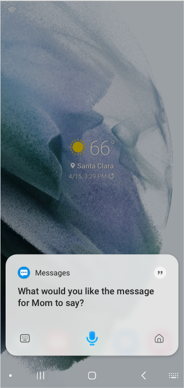
Additionally, consider replacing any views that have touch-forward components with simpler views that enforce voice interaction with users. For example, if users want to send a text message, you can ask "What would you like the text message to say?" and rely on ASR to form the response and send it back to Bixby, instead of adding a form with a text block that the user can write in instead. Users still have the option of tapping on the keyboard icon on the lower left corner of the view to type a response back to Bixby instead of saying it out loud.
You can adjust the time it takes for the conversation to time-out in views. As such, consider how much time it would take for the user to process the information in your view with how long the conversation will last.