Universal Components
This guide covers components you can use across multiple moments. These components are pre-formatted so that you don't have to worry about spacing, sizing, or grouping of specific pieces of information. Read about each component in the following sections for more information.
If your component contains an image, be aware of the contrast both in light mode and dark mode. For examples on optimizing between these modes and information on how to implement different images for different modes, see the Theme Support sample capsule.
Divider
Use the divider component to separate information within a view. If you need to add a separator between similar components, you should use a partitioned component instead. You should minimize divider use. Dividers should not be used at the beginning or end of a list.
Here are the specifications for the divider component:
Stroke : 1px
Color : #FAFAFA
Opacity : 12%
Hbox and Vbox
The hbox component (and the containing vbox components) is a container box that you can use to make a table. The hbox is a horizontal box that spans the width of the screen. The vbox is a vertical box that goes into an hbox. We recommend three or fewer vbox components nested in an hbox. This component is particularly useful for examples like a sports tournament or a flight status from point A to B.

Image
If you have a standalone image for your result, you can use the image component. This is particularly useful if you're showing results at a Done Moment or in a Receipt layout.
Paragraph
Use a paragraph when your content spans more than two lines on the screen. This is a good way to give longer explanations or descriptions of results.
Partitioned
The partitioned component creates separation between components. We recommend you use this when looping through recurrent child components; otherwise, we recommend you use the divider for non-recurring information. The first and last lines do not show a line.
Here are the specifications for the partitioned component:
Stroke : 1px
Color : #FAFAFA
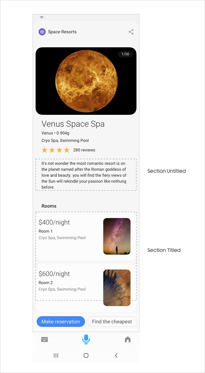
Opacity : 12%Section
A section is the highest level component. As such, it has no parent. Sections are used to separate content groups. For example, you can have a detail paragraph in one group and thumbnail cards in another group.
Its height flexes based on nested children, meaning there is no limit to the number of children. It has no customizable properties. A section title is optional, and the title text style can’t change.
Single Line
The single-line component can display text, images, and spacers in one row in any combination and order (which means you could have just an image or just text in a single line if needed). The text, images, and spacer sizes are all customizable.
Valid Colored Text
Colored text is valid in the single-line component, but only to show contrast between values. You must follow this guideline, as it will be restricted for use in the Marketplace.
This table lists the specs for the colors:
| Color | Hex Code |
|---|---|
| Blue | #0997FF |
| Green | #00DA4D |
| Amber | #FFA300 |
| Red | #FF4610 |
Single-Line Spacer
In a single-line component, you can specify a spacer that leaves space between images and text. This spacer size comes in a Small, Medium, and Large size, depending on how big of a spacer you need between content. The specifics vary between device, which you can see in the interactive demo above.
Spacer
A content spacer makes a 24px space between components vertically. Our default space between components is 12px. Use the spacer when you want to double the space.