Bixby Developer Center
Guides
- Design Guides
- Developers' Guides
- Release Notes
- Bixby Capsule SDK Release Notes
- 24C Capsule SDK Release Notes
- 24B Capsule SDK Release Notes
- 24A Capsule SDK Release Notes
- 2023 October-December
- 2023 July-September
- 2023 April-June
- 2023 January–March
- 2022 October–December
- 2022 July–September
- 2022 April–June
- 2022 January–March
- 2021 October–December
- 2021 July–September
- 2021 April–June
- 2021 January–March
- 2020 October–December
- 2020 July–September
- 2020 April–June
- 2020 January–March
- 2019 October–December
- 2019 July–September
- 2019 April–June
- 2019 January–March
- 2018 October–December
- 2018 July–September
- 2018 April–June
- 2018 January–March
- 2017 March–December
- Bixby Developer Studio Release Notes
- Version 8.23.0
- Version 8.22.0
- Version 8.21.1
- Version 8.20.0
- 2022 October - December
- 2022 July - September
- 2022 April - June
- 2022 January - March
- 2021 February-October
- 2020 October - December
- 2020 July - September
- 2020 April - June
- 2020 January - March
- 2019 October - December
- 2019 July - September
- 2019 April - June
- 2019 January - March
- 2018 October - December
- 2018 July - September
- 2018 April - June
- 2018 January - March
- Developer Center Release Notes
- Deprecations
- 6832 (JavaScript Runtime Version 1)
- 6832 (Conversation Behavior)
- 6831 (Audio Control Album Art Size/URL)
- 6830 (Layout And Template Macros)
- 6829 (Capsule Description Terms And Privacy Policy)
- 6828 (Boolean Reprompt Functions)
- 6825 (Payment Selection)
- 6823 (Equal Parents Alias)
- 6822 (Wild Card Match On Confirming Link)
- 6821 (Lock Screen Permission Update)
- 6819 (Case-Insensitive Categories)
- 6817 (Invalid Types in EL Function Params)
- 6816 (Remove Non-Card Components From List)
- 6815 (Require Symbol Set Equality)
- 6814 (Input Cell OnClick)
- 6813 (JS Preconditions)
- 6812 (Card OnClick)
- 6811 (Import Macro Requires Qualification)
- 6810 (Changes to EL Node Evaluation Functions)
- 6809 (Category Updates (20C))
- 6808 (Require HTTPS on Authorization Endpoints)
- 6807 (Activity Support Time Cardinality Violation)
- 6806 (Activity Support Time Value Required)
- 6805 (Text Lib Library Deprecation)
- 6804 (Text In Pattern Training)
- 6803 (User Profile Access Permission)
- 6800 (User Nickname)
- 6799 (Enum Subtypes Cannot Add Symbols)
- 6798 (VivContext User ID Internal)
- 6797 (Move From Runtime Flags To Runtime Version)
- 6795 (Action Delegate To)
- 6794 (Marketplace Constraints)
- 6793 (EL exists() and size() Functions)
- 6791 (Compare EL)
- 6789 (View Behavior)
- 6788 (Prompt Min/Max)
- 6785 (VivContext User ID Non-Internal)
- 6784 (MD5 Library Deprecation)
- 6783 (Implicit Library Declarations)
- 6781 (Special Snapshot Node Properties)
- 6779 (Hint Key Rename)
- 6777 (Input Name Validation)
- 6776 (Require Permission Justification)
- 6775 (Input View For Details)
- 6774 (Prompt Mode)
- 6772 (Max Store Sections)
- 6767 (Modern Default View Behavior)
- 6764 (No Filtering With Validation)
- 6763 (Macro Cardinality Restriction Enforcement)
- 6759 (Card Chin)
- 6750 (Icon And Image Assets)
- 6748 (Capsule Description)
- 6744 (Min/Max Constraints)
- 6742 (No Role Properties)
- 6735 (Inherited Concept Features)
- 6734 (Hands-Free EL Function Changes)
- 6732 (Modern Prompt Rejection)
- 6729 (Halt In Computed Inputs)
- 6727 (Capsule Info Name)
- 6725(Sort Signals)
- 6723 (Localized Capsule Properties)
- 6691 (Simplify Group Constraint)
- 8 (Library Version Upgrade Recommended)
- 7 (Training Entries Limit Exceeded)
- Bixby Capsule SDK Release Notes
References
- Bixby Language Keys
- action
- activity-support
- authorization
- boolean
- capsule
- capsule-info
- confirmation-view
- decimal
- dialog
- endpoints
- enum
- hints
- input-view
- instantiation-strategy
- integer
- intent
- layout
- layout-macro-def
- legal
- macro-def
- name
- navigation-support
- preference-support
- profile-support
- qualified
- result-view
- selection-strategy
- structure
- structure-enum
- template
- template-macro
- template-macro-def
- text
- transaction-support
- Bixby Views Components
- attribution-link
- audio-control
- auto-complete
- calendar
- cell-area
- cell-card
- compound-card
- date-picker
- duration-picker
- hbox
- image
- image-area
- image-card
- image-carousel
- image-list
- image-list-of
- image-picker
- input-cell
- map-card
- paragraph
- partitioned
- permission-link
- progress-bar
- section
- single-line
- split-input-cell
- thumbnail-area
- thumbnail-card
- time-picker
- title-area
- title-card
- video
- Expression Language Reference
- Bixby APIs
- Library Capsules
- Audio Player (bixby.audioPlayer)
- Contact (bixby.contact)
- Core (viv.core)
- DateTime (viv.time)
- Entity (viv.entity)
- Geography (viv.geo)
- Open Hours (viv.openHours)
- Image (viv.image)
- Location Autosuggest (viv.location)
- Measurement (viv.measurement)
- Money (viv.money)
- Navigation (viv.navigation)
- Phone Call (bixby.phoneCall)
- Rating (viv.rating)
- Sharing (viv.shareVia)
- Profile (viv.self)
- Text Message (bixby.textMessage)
- JavaScript API Reference
- Assertions Reference
- Library Capsules
- Reserved Utterances
- Capsule Configuration
- Natural Language Categories
- Astrology
- AudioBook (Audiobooks)
- Coffee Order (Coffee Ordering)
- CookingNRecipe (Recipes)
- CurrencyConversion (Currency Conversion)
- DeliveryNTakeout (Food Delivery)
- Events
- FlightBooking (Flight Booking)
- FlightInfo (Flight Status)
- Flowers
- Gifts
- HomeServices (Home Services)
- Hotels
- Careers and Networking (JobSearch)
- LanguageLearning (Language Learning)
- LocalBusinesses (Local Businesses)
- Lottery
- Meditation
- MovieTickets (Movie Tickets)
- News
- Podcast (Podcast)
- Radio
- RealEstate (Real Estate)
- RestaurantSearch (Restaurants)
- RideShare (Rideshares)
- ShoppingList (Shopping Lists)
- SleepSounds (Sleep Sounds)
- SportsScore (Sports Scores)
- StockInfo (Stock Quotes)
- Translators (Translation)
- Trivia (Trivia Games)
- Videos
- Weather
- Keyboard Shortcuts
- Dialog Modes
- Articles and White Papers
- Glossary
- Additional Resources
Samples & Templates
- Samples
- Audio
- Bixby Views
- Continuations
- Dialog Affirmation
- Input Validation and Error Handling
- HTTP API Calls
- Input Forms
- Location Search
- Match Patterns
- Mock Data
- No Code Design Patterns
- Permissions
- Phone Calls
- Preference Learning
- Refreshing Content
- Selection Learning
- Share Via
- SSML Examples
- Text Messages
- Theme Support
- User Context
- User Persistence
- Video Player
- Walkthroughs
- Templates
- Prototypes
- Videos
- Coding with Adam: Build a Bixby Capsule in Under An Hour
- Bixby Tutorials
- SDC 2019 Videos
- Bixby 101: Getting Started
- Bixby Developer Studio Tour
- Bixby Developer Center and Marketplace
- Natural Language Training: Best Practices for Bixby
- Bixby Views and User Experience Best Practices
- Building Bixby Conversational Experiences for Devices with and without Screens
- Debugging and Testing Capsules in Bixby Developer Studio
spacer
optionalmultiple allowed
Creates a spacer that is 24px between two components within a section's content. This is useful if you need to create a larger spacing between components in a given section than the default (which is 12px). While multiple spacers are allowed in a content container, multiple spacers in a row will be condensed to a single spacer.
Examples
// within a larger Views file
...
section {
  content {
    title-area { ... }
    spacer // 24px
    paragraph { ... }
    // no spacer, 12px space between these two components
    single-line { ... }
  }
}
...
layout {
section {
content {
image {
url ("[#{value(movie.posterUrl)}]")
aspect-ratio (3:4)
object-fit (Contain)
lightbox-enabled (true)
}
paragraph {
value ("#{value(movie.title)}")
style (Title_M)
}
spacer
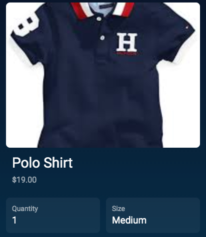
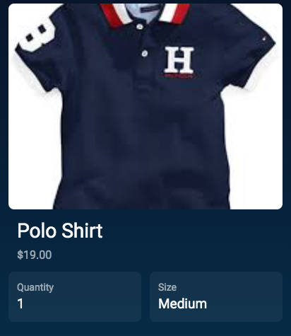
Here is how a view appears, with and without a spacer respectively. In the first image, the spacer is between the image-card and the split-input-cell:


Copyright 2024 Samsung All rights reserved