Result Component Patterns
Use these components and their design specifications with Result Moments in Result Views.
In addition to the components listed, you can also use the universal components to further organize and format your information.
If your component contains an image, be aware of the contrast both in light mode and dark mode. For examples on optimizing between these modes and information on how to implement different images for different modes, see the Theme Support sample capsule.
Components for Multiple Results
When displaying multiple results, display each result item in a card. The types of cards, when to use them, and an interactive demo are available below.
These pre-set components are advantageous because they can display information without having to worry about spacing between the components or which groups of components go well together.
Image Card
Use image cards when the image contains priority information requiring the user to make a decision. You can get the best visual impact with high-resolution dynamic images. An image card contains a title-area and an image.
This includes, but is not limited to, the following examples:
- Artist posters
- Food images
- Product close-ups
- Beautiful nature scenes

Thumbnail Card
Use thumbnail cards if the image you're adding is only supplemental information. Thumbnail cards work well for lists where images are not the top priority, such as news headlines. Thumbnail cards are particularly useful for highlights.
The thumbnail area can be an illustration or an icon as well. You can use lower resolution images that are often provided by users. This includes, but is not limited to, news icons, portrait images and low-resolution images.
Title Card
The title-card is a pre-made card for simple text.
An image is not the only way to make the design bold. If your results don't have images, you can also use a title-card with larger text to make the design more impactful. To maintain information hierarchy, limit the text information presented.
Cell Card
A cell-card is best used with an avatar image and a single line of text that contains more informational content. You can only use a primary and secondary text slot for cell cards, so you can't use title fonts in this card. If you want a primarily text-based card, use a title card instead.
Compound Card
If you can't find a card style that fits your needs, you can create a custom card with compound-card.
A compound card requires a touch event. You should only use the compound card when it takes the user to a new Bixby View for more information.
Components for Single Result
You can use these components for displaying the details of a single item. Examples of components you can use are listed below. You can also use universal components to add any information needed to display the result.
Use cards in these situations only if they don't have an on-click defined because they display as a content area. Areas have the same format and structure as a card, but are not clickable, so they don't have the lightbox background and do not have rounded corners. Cards, on the other hand, should have an action happen when a user taps on it. For more information, see Cards.
Cell Card without an on-click
Create a cell area by using a cell-card without an on-click definition.
Image Carousel
Use an image-carousel to dive further into points of interests, entertainment content, or events.
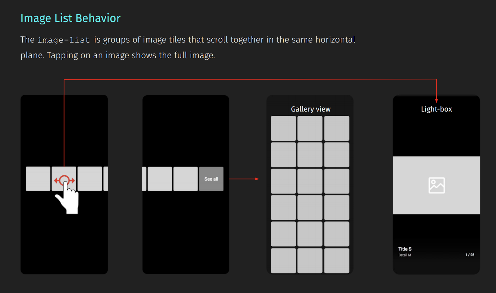
Users can swipe horizontally through the carousel, and tap on an image to open the image in full screen lightbox mode in the gallery view. The image carousel has a fixed ratio, and the maximum number of images shown in the carousel is 9. If you have more than 9 images, the last image will render with "See More". If users tap on the "See More", they can view all images in lightbox mode.
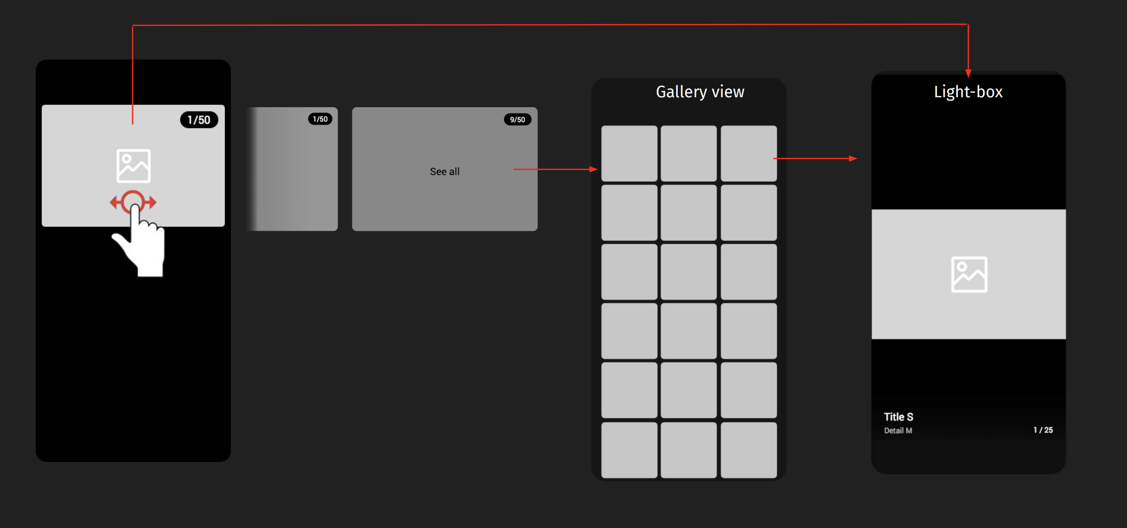
Image List
Use an image-list for a scrollable horizontal list of images.
If more than 9 images are in the image list, the "See All" slot will render at the end of the image list. If you add an image list to a compound card, the image list displays the first three images.
Title Area Without an on-click
A title-area is a pre-set for titled content, with supplemental information organized in a three-slot system. Title areas are primarily used within other cards. If you want to add information in just a title area, use a title-card without an on-click, so that the title card displays as a title area. (See the note in the Components for Single Result.)
Thumbnail Card Without an on-click
A thumbnail-card is another pre-made card that contains a small image and a title-area. If you are displaying a single result and don't need to have the user punch out of Bixby, don't specify an on-click.