
Creating Bixby Views
Bixby lets you construct views to build your capsule's user interface. Bixby Views consist of the same key-value modeling language used to define Bixby's models. By using them, you can create interactive designs for Bixby in a simple, consistent manner. Views render the content of Moments in a Bixby conversation, within the content zone of a device's screen.
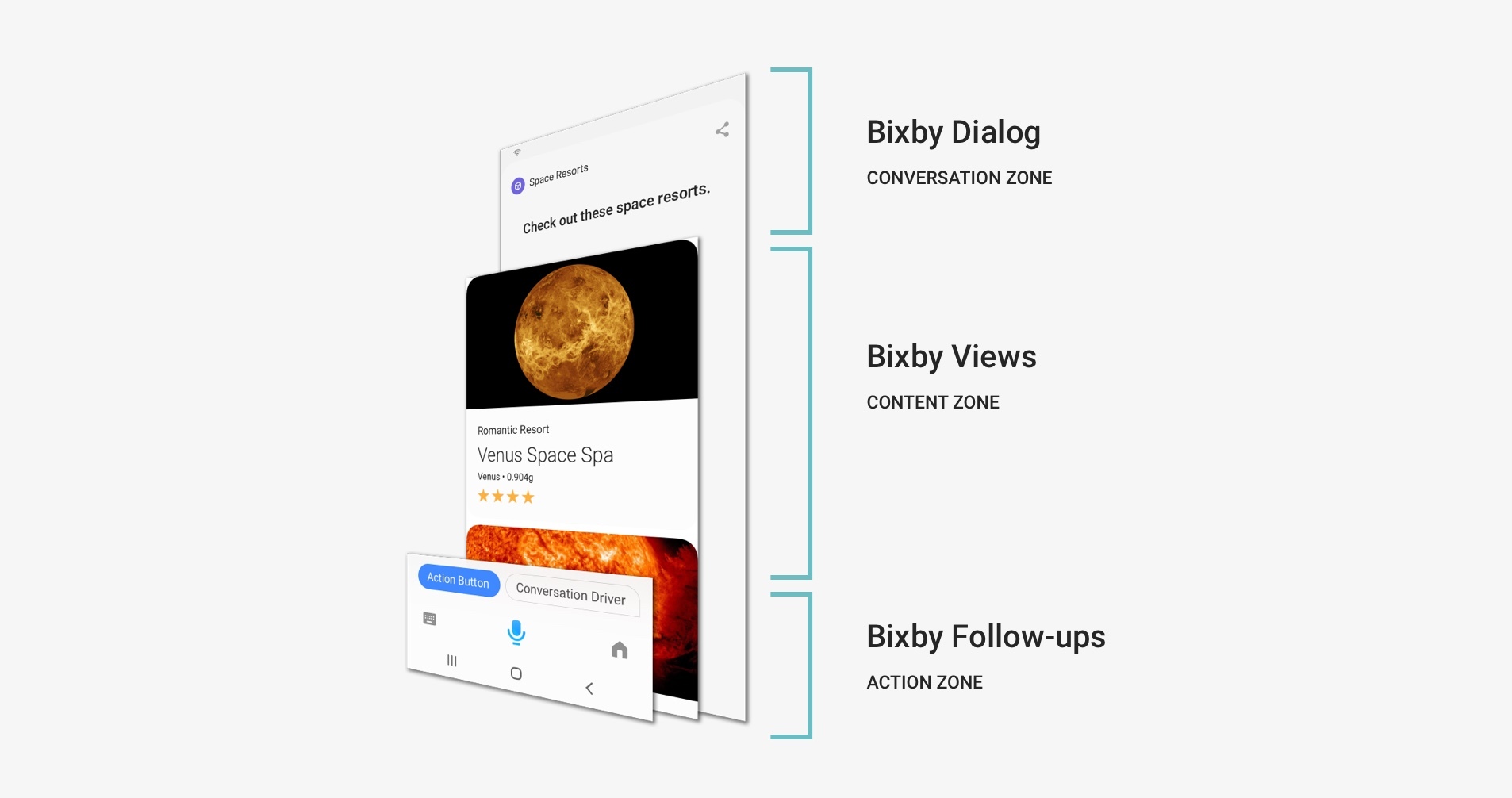
There are three view types:
- Result views define the layout used for results returned from Bixby.
- Input views contain buttons, fields, and other input elements that allow users to give Bixby information.
- Confirmation views are shown when Bixby is about to execute an action that requires user approval or review before proceeding. These views are used mostly in transactional workfows.
View definitions start with a render block. Within render blocks, you'll find either input components for user input, or layouts that describe the contents of result views and confirmation views. A layout is built out of layout components. Components include text, images, titles, sections, and even maps and image carousels. Building a layout in Bixby Views is similar to building a web page, but views have a more clearly defined hierarchy: some components are containers for other components, but not every kind of component is valid within a given kind of container. For more about input components, which do not use layouts, read about input views.
View files, including layouts and layout macros, belong under your capsule's /resources/ folder, either in /resources/base/ or in subfolders for device targets and locales if appropriate. A good practice is to put them in a layouts/ subfolder, and optionally use subfolders within layouts/ if you want further organization.
For more information about individual components used in each view, see the appropriate reference pages for each view and each component. You can also play with the Bixby Views sample capsule and the Input Forms sample capsule to see these views, and the subsequent layouts and layout macros in action. All the examples below use the Space Resorts Walkthrough sample capsule unless noted otherwise.
View Basics
A Simple Layout
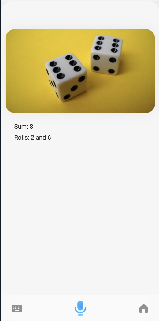
To learn about Bixby Views, let's look at the result view from the Dice capsule you built in the Quick Start Guide. This file is in the resources/ folder, and by convention is named after the concept it matches on: RollResult.view.bxb.
result-view {
  match {
    RollResultConcept (rollResult)
  }

  render {
    layout {
      section {
        content {
          single-line {
            text {
              style (Detail_M)
              value ("Sum: #{value(rollResult.sum)}")
            }
          }
          single-line {
            text {
              style (Detail_M)
              value ("Rolls: #{value(rollResult.roll)}")
            }
          }
        }
      }
    }
  }
}
This view uses a match pattern to associate it with the concept RollResultConcept. When the output to be displayed to the user is a RollResultConcept, this view will be used to display it.
The view itself is defined in the layout block. This layout has a single section, which in turn contains a content block with two single-line elements, each with a style (in this case, both are Detail_M) and value. This creates a simple nested hierarchy:
- Layout
- Section
- Content
- Single Line
- Text ("Sum: ...")
- Single Line
- Text ("Rolls: ...")
- Single Line
- Content
- Section
Bixby Views are similar to HTML documents in this way: blocks nested within blocks. Instead of using tags like <section> and <p>, views just use Bixby keys like section and text.
Let's spruce Dice's output up a little with some graphics. Add an image block right under the content key:
content {
  image {
    url (https://upload.wikimedia.org/wikipedia/commons/thumb/7/73/Double-six-dice.jpg/1200px-Double-six-dice.jpg)
  }
  // single-line { ...
}
Now, when you roll some dice, you'll see an image!
- For more details on layouts, read the Layouts documentation.
- For a detailed discussion of the components that can go into layouts and how to style them, read the View Components documentation.
Reusable Layouts with Macros
Sometimes you might create a complex layout that you want to use in more than one view. For instance, a layout that shows details of a hotel or a restaurant could be shown in a list of search results as well as used on a page for making a reservation. Bixby Views lets you reuse partial layouts with macros. Here's a quick overview.
Let's say you wanted to turn the result view from Dice into a macro. You'd define it with a macro-def block. This block would be part of a *.macro.bxb folder in the appropriate locale-specific folder under resources/; while it could be in its own file, you can have multiple macros in one file.
macro-def (roll-results) {
  params {
    param (rollResult)
    type (RollResultConcept)
    min (Required) max (One)
  }
  content {
    section {
      content {
        single-line {
          text {
            style (Detail_M)
            value ("Sum: #{value(rollResult.sum)}")
          }
        }
        single-line {
          text {
            style (Detail_M)
            value ("Rolls: #{value(rollResult.roll)}")
          }
        }
      }
    }
  }
}
This begins with a parameter list (params), which defines parameters for the macro. In this case, we need to be able to display the contents of a RollResultConcept. The param block works a lot like the match block in the original view, binding the value of a RollResultConcept to rollResult for use later. The render block is replaced with a content block that defines the layout macro's content.
With this macro defined, our original result view for Dice now looks like this:
result-view {
  match {
    RollResultConcept (rollResult)
  }

  render {
    macro (roll-results) {
      param (rollResult) {
        expression (rollResult)
      }
    }
  }
}
For extensive coverage of layout macros, read the Reusing Content With Macros Developers' Guide.
Displaying Lists
Unlike HTML, Bixby Views can contain conditionals and control flow commands. The for-each loop is particularly useful, iterating through an array of structures to render each element in a separate view component. You could also use if-else blocks to selectively render elements.
Here's an example that uses both of those techniques. This is the result view from the example.userDataPersistence sample capsule:
result-view {
  match: UserData(userData)
  message {
    if (exists(userData)) {
      template ("At your service.")
    } else {
      template ("You have no army.")
    }
  }
  render {
    if (exists(userData)) {
      layout {
        section {
          title {
            template (Boss)
          }
          content {
            single-line {
              text {
                value ("[#{value(userData.boss)}]")
                style (Title_XL)
              }
            }
          }
        }
        section {
          title {
            template (Minions)
          }
          content {
            for-each (userData.minions) {
              as (minion) {
                single-line {
                  text {
                    value ("[#{value(minion)}]")
                    style (Title_S)
                  }
                }
              }
            }
          }
        }
      }
    }
  }
}
This uses a for-each loop to loop through each userData.minions value. The conditional if/else block outputs a different message, depending on if userdata exists.
A result view can also use the list-of key to render a list. However, if you use this key, you must use a card component to list each item. This is a similar looping construct; read its reference page for more details and a complete example from Space Resorts.
An input view can display a list with the selection-of key to render a list that users can choose from. If you use this key, you must use a card component to list each item. Read its reference page for more details and an example from the Input Forms sample capsule.
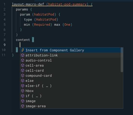
Using the Component Gallery
When building layouts, you can use the Component Gallery feature in Bixby Developer Studio, which can be started by invoking autocompletion when the cursor is at a point in a view definition where a Bixby Views component can be inserted. This is typically within a content block, and must be within a *.view.bxb, *.macro.bxb, or *.layout.bxb file.
In this example, the cursor is within a currently empty content block. When autocomplete is invoked by pressing Ctrl + Space, an option for "Insert from Component Gallery" appears:
Selecting that option brings up the Component Gallery, which will let you view different components such as cards, areas, and lists. The Gallery has similar functionality to the interactive elements within the Component Design Guide.
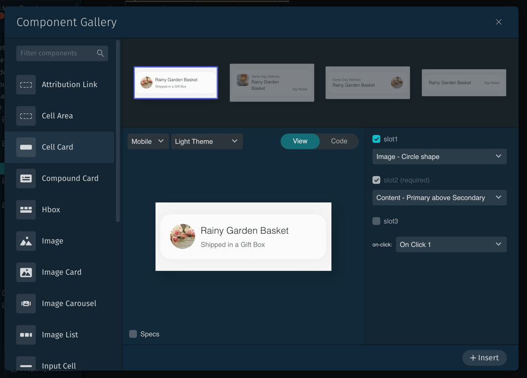
You can choose presets that offer different variations for the selected component, and further customize elements such as slots and labels. The Component Gallery lets you preview a component on select device types; on simulated mobile devices, you can choose light and dark modes. These presets are intended as starting points that you'll customize with text and settings appropriate to your capsule.
Toggle between a rendering of the component and the code for it by clicking View or Code. Check the Specs checkbox to display pixel size and spacing for the selected device's content rendering.
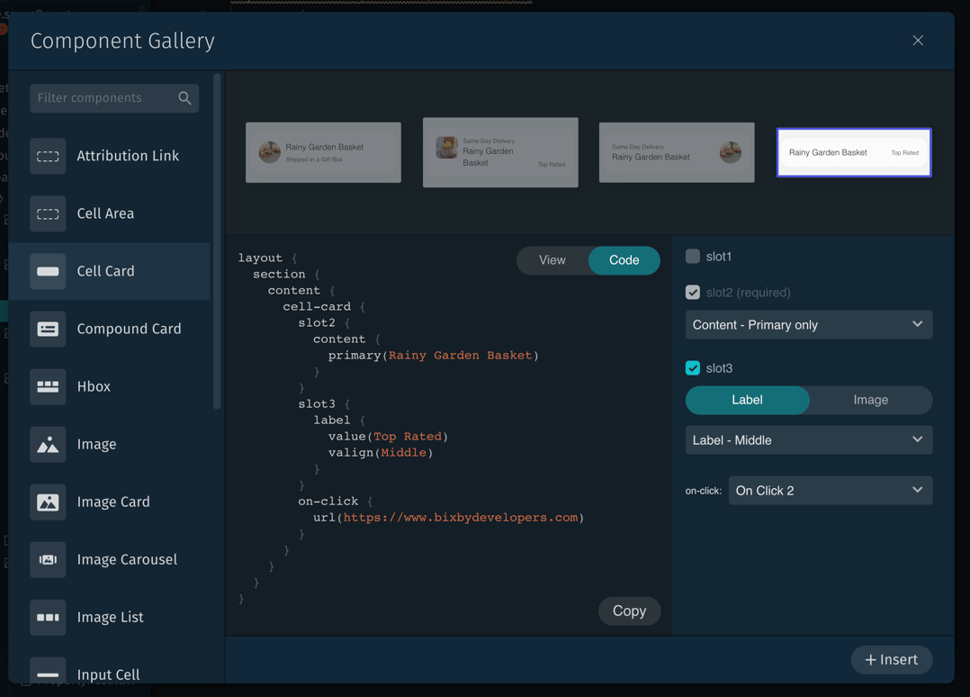
Click the + Insert button to insert the code for the configured component into your capsule's layout. You can also copy the code to the clipboard with the Copy button in the code view. Once inserted (or pasted from the clipboard), you can further customize the code, changing label text and images, using templates, and so on.
Result Views
The views we've been describing above are all result views. Result views let you build displays for search results, individual detail pages, image carousels, and more. A result view can also directly launch an outside application. They're what Bixby displays during a Result Moment.
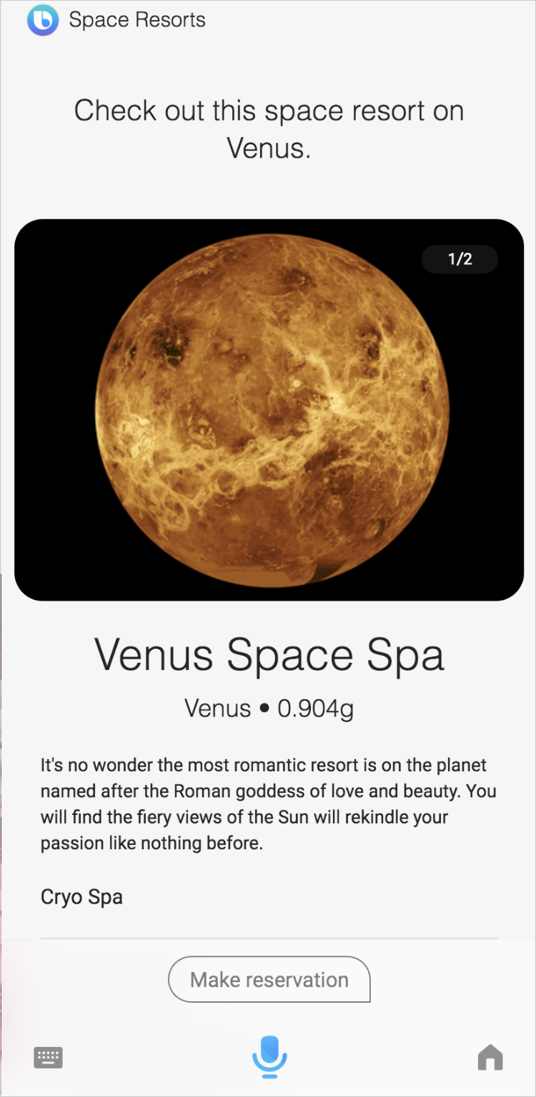
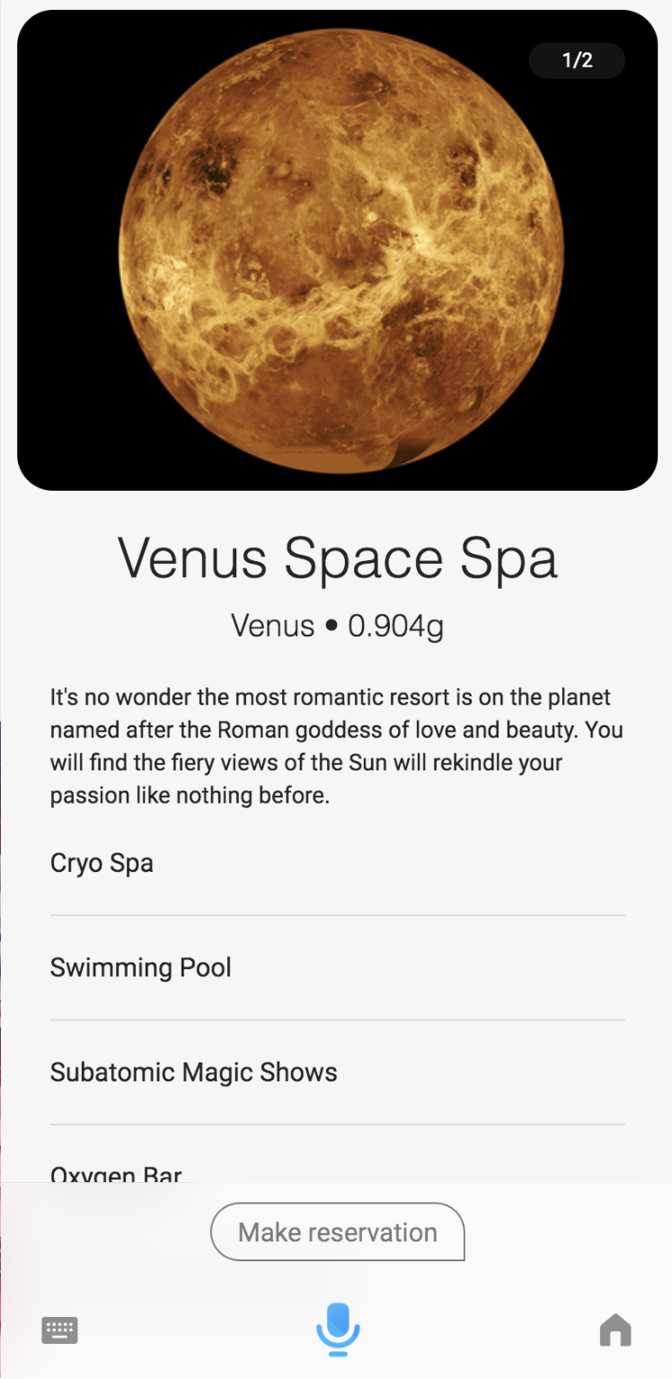
We've seen some simpler result views above. This is an example of a more complicated view from the Space Resorts capsule. It shows information about a single resort, and uses a layout macro to include both an image carousel and a detail view:
result-view {
  // This view is used to show the SpaceResort details when the user select a space resort from a summary list. This follows the design paradigm to go from Summary to Details
  match {
    SpaceResort (result)
  }

  render {
    // We know the size is always 1 because this view is only attainable when drilling into a single item to see the details
    // Lists of space resorts are handled in the ViewAll_Result and Input files
    if (size(result) == 1) {
      layout {
        macro (space-resort-details) {
          param (spaceResort) {
            expression (result)
          }
        }
      }
    }
  }

  conversation-drivers {
    if ("size(result) == 1") {
      conversation-driver {
        macro (MakeReservation)
      }
    }
  }
}This is an example of what would display:
Here's the layout macro definition being used in the above view.
macro-def (space-resort-details) {
  params {
    param (spaceResort) {
      type (SpaceResort)
      min (Required) max (One)
    }
  }
  content {
    section {
      content {
        image-carousel {
          images (spaceResort.images)
        }
        title-area {
          halign (Center)
          slot1 {
            text {
              value ("#{value(spaceResort.name)}")
              style (Title_L)
            }
          }
          slot2 {
            single-line {
              text {
                value ("#{value(spaceResort.planet)} • #{value(spaceResort.gravity)}g")
                style (Title_XS)
              }
            }
          }
        }
        paragraph {
          value ("#{value(spaceResort.description)}")
          style (Detail_M)
        }
        partitioned {
          content {
            for-each (spaceResort.attributes) {
              as (attribute) {
                single-line {
                  text {
                    value ("#{value(attribute)}")
                    style (Detail_L)
                  }
                }
              }
            }
          }
        }
      }
    }
  }
}This layout macro corresponds to this part of the result view rendered above:
A result-view can have the following components in its render block:
- A list of results (
list-of). - A list of results as a collection of images (
image-list-of) - A layout, which could be defined in the file itself with
layout, or included from a separate file withlayout-matchormacro. - Nothing, using the
nothingkey.
The number of items that returns should dictate what you render. For zero results, use nothing or a layout. For a single result, use the Details mode or call the detailed layout-macro for that item. For multiple results, use list-of or image-list-of to show a list that has a summary layout of each item. If a user clicks on a result in a list, Bixby takes them to the details layout for that item. If only a single result is returned, Bixby automatically takes the user to the details layout. If the user clicks on that item, nothing happens. You can differentiate between a single result being returned versus when a user has tapped for more details with the isElement expression language function.
If you don't create your own view for each of these situations, a default view is created for you.
If you need the user to be taken to an outside application, Bixby can directly launch that application with the result-view. You should only punch out to an app in the situations outlined in the App Punch Out Policies.
When users reach a result view that includes conversation drivers, they are locked into that specific capsule for 10 seconds, unless they cancel out of that capsule.
Input Views
Input views let your capsule gather information from the user during an Input Moment. Unlike result and confirmation views, input views do not use layouts in their render blocks. Instead, they use their own set of input components. Input components allow users to easily pick time, date, images, and find information with the aid of auto-complete. You can also use components to create forms with text and numbers.
Here is an example input-view you might use to get reservation dates using a calendar:
input-view {
  match: DateInterval (this)
  message {
    macro (DATE_INTERVAL_ELICITATION)
  }
  render {
    calendar {
      allow-range (true)
      restrictions {
        block-past-dates (true)
      }
    }
  }
}Here is what would display:
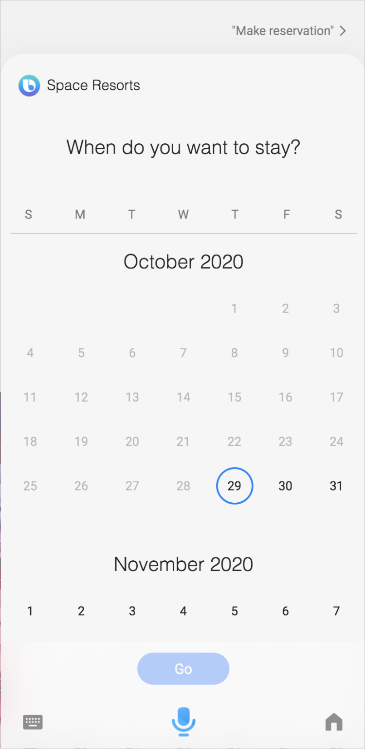
An input-view must include a match block that defines the data this view is for: in this case, picking the checkout date. The render block renders the view, using a calendar component.
The keys in the render block of an input-view include components for pickers, auto-complete (search fields), and forms:
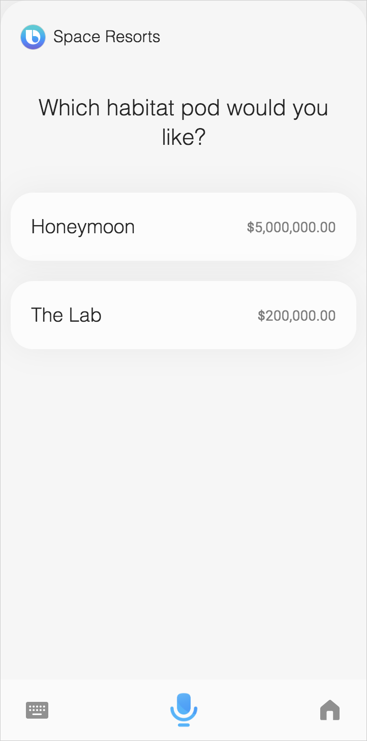
date-picker: lets users select a datetime-picker: lets users select a timecalendar: lets users select a date or date range from a calendarimage-picker: lets users select one or more imagesselection-of: lets users choose one or more items from a given listauto-complete: presents a search field with completion suggestions from a given listform: generates a view with editable fields for users to input information
For complete documentation about input components, consult the reference page for that particular component.
Here is another example of an input component that allows the user to make a single selection from a list:
For additional examples of input views, see the Input Forms sample capsule.
Similar to result views and confirmation views, you can specify a layout, or include a separate file with layout-match or macro.
Confirmation Views
Confirmation views let you build user interfaces for reviewing and confirming actions during a Confirmation Moment. These views should only be used in a transactional workflow or if you need a user to confirm an action.
As with result views, confirmation views can use layouts and macros. In addition, confirmation views can use transaction components in their layouts.
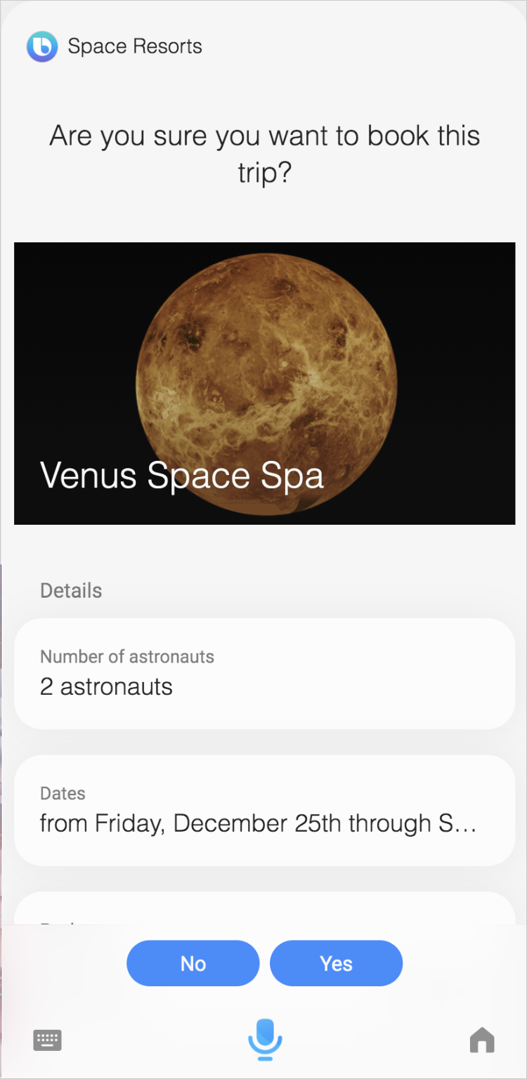
Here is the confirmation view for the space resort capsule, which confirms the order:
confirmation-view {
  match {
    Confirmation {
      confirming {
        MakeReservation (action)
      }
    }
  }

  message {
    macro (COMMIT_ORDER_CONFIRMATION)
  }

  mode (PositiveEmphasis)

  render {
    layout {
      macro (order-image-card) {
        param (order) {
          expression (action.order)
        }
      }
      macro (order-details) {
        param (order) {
          expression (action.order)
        }
      }
      if (exists(action.order.buyer)) {
        macro (order-contact-information) {
          param (order) {
            expression (action.order)
          }
        }
      }
    }
  }
}Here is an example of what might display:
The render block of a confirmation-view can only include layouts:
- A layout can be directly included in the
renderblock withlayout - A layout can be defined in an external file with
layout-matchormacrocan be defined in an externallayout.bxbfile - A layout can also be defined in a
macroin an externalmacro.bxbfile
If you are confirming a transaction and need to verify payment from a user, you should punch the user out to the app or website to complete the transaction.
The on-confirm and on-abort blocks generate Action Buttons automatically in the confirmation view, which appear in the action zone of Bixby, before the conversation drivers. In general, your action buttons should move the conversation with users forward. If users need to regress in the conversation, they can use their device's back button.
You can change the color of the action button in the capsule-info.bxb file using the action-fg-color and the action-bg-color.
For more information on how confirmation prompts work, see Confirmation Prompts in the Enriching the Conversation Developers' Guide and Confirmations in the Guiding Conversations Developers' Guide.
Default Views
If you do not specify a result-view or an input-view that matches the current moment, Bixby uses a default view that can provide a reasonable display of results or selectable options to the user. Your capsule should provide its own views for the best possible conversations with users. Read Bixby's Design Guides for guidance.
There is no default confirmation-view, although Bixby falls back to default confirmation dialog and displays if views are not defined for confirmation moments.
Default Result View
result-view {
  match: _ (this)

  message {
    if (size(this) == 0) {
      template ("#{event(this, 'NoResult')}")
    } else {
      template ("#{event(this, 'Result')}")
    }
  }

  render {
    if (size(this) == 0) {
      nothing
    } else-if (size(this) == 1) {
      layout-match(this) {
        mode (Details)
      }
    } else {
      list-of (this) {
        navigation-mode {
          read-many {
            page-size (size(this))
            page-content {
              underflow-statement ()
              overflow-statement ()
            }
          }
        }

        where-each (item) {
          layout-match (item) {
            mode (Summary)
          }
        }
      }
    }
  }
}
Default Input View
input-view {
  match: _ (this)

  message {
    if (size(this) == 0) {
      template ("#{event(this, 'Elicitation')}")
    } else {
      template ("#{event(this, 'Selection')}")
    }
  }

  render {
    if (size(this) > 0) {
      selection-of (this) {
        navigation-mode {
          read-many {
            page-size (size(this))
            page-content {
              item-selection-question()
              underflow-statement ()
              overflow-statement ()
            }
          }
        }

        where-each (item) {
          layout-match (item) {
            mode (Summary)
          }
        }
      }
    }
  }
}
Considerations for Using Views
When creating a view, you need to know what Moment in a conversation and what type of experience you are building for. The Designing With Bixby Views guide can help you figure out which View you need during the conversation, as well as which components to use in the various moments. Use the Simulator to test your views.
Make sure you organize your views file as you would organize all your capsule resources.
Additional considerations for special features are in the following sections.
Light and Dark Themes
Some images in your capsule, particularly icons, might not be visible or legible when set against a light background in Bixby's light theme. You can specify alternate images for the light theme by using the light-theme key, which is available in most view components that let you specify an image by URL. There is also a corresponding dark-theme key that can be used if the default icon or image is more visible/legible in the light theme.
url (icon-default.jpg) {
  light-theme (icon-light.jpg)
}For a working example of using light-theme and dark-theme, see the Theme Support Sample Capsule.
Hands-Free Mode
If you are developing a capsule and eventually want to develop for hands-free mode, you should read the Hands-Free List Navigation guide.
Multiple Locales and Devices
If you are planning to support multiple targets, you should read the Hands-Free and Multiple Devices Design Guide for supporting multiple devices and the Localizing Capsules Guide for supporting multiple locales.
Not all components are supported on all devices, such as video on watch devices. Additionally, components might display differently depending on the device.
Make sure to check the reference for each component (including how it might display on devices with the interactive demo). You should also test your capsule in the Simulator to see how your components display on different devices. See Settings View in the Simulator Guide for more information.
Flexible UX
Most mobile clients for Bixby support Flexible UX, a user interface that aligns with the Samsung OneUI design. It has a compact user interface for Bixby Views. If you are modifying existing pre-OneUI designs, you might need to adjust your view files to this more compact design. Additional design considerations can be found in the Flexible UX Design Guide.
Most capsules on mobile will automatically adjust to Flexible UX and you will likely not need to update your view files.
However, if you would like optimize for Flexible UX, you can create a custom view file and put it in the bixby-mobile resources folder.