
Layouts
When building your capsule, it's important to teach Bixby how to display results and interactions in a user-friendly way. For example, in the Quick Start Guide, you see how adding a layout to the capsule improves the way in which Bixby displays dice game results.
Layouts offer a powerful way for you to control and customize the visual look and feel of your capsule. Layouts are defined in .layout.bxb files, and are rendered within views:
- Result views define the layout used for results returned from Bixby.
- Confirmation views display prompts for user feedback.
- Input views contain buttons, fields, and other input elements that allow users to give Bixby information.
For more information about the kinds of views and the components you use to construct them, read Creating Bixby Views. Using Bixby Views helps keep the look and feel of capsules consistent within Bixby.
Be aware of which components you are adding to your layouts and layout macros, because different components are available under different views. If you call a layout or layout macro in a view and that layout specifies a component that the view does not support, Bixby Developer Studio will throw an error. Similarly, you should consider which layout macros are being called within a layout itself. The same layout macro invoked in one component might not be valid if used within a different component, as the list of supported child components could differ.
You can read the Designing with Bixby Views Design Guide and the Building Bixby Views (UI) Developers' Guide to check if your layout is using the correct components for that moment and that view.
Additional patterns and guidelines for layouts can be read in the Designing with Bixby Views Design Guides.
Layout Format
Layouts follow a specific format. To explore it, we'll look at the "Space Resorts" sample from Creating Bixby Views. This is a small results view:
result-view {
  // This view is used to show the SpaceResort details when the user select a space resort from a summary list. This follows the design paradigm to go from Summary to Details
  match {
    SpaceResort (result)
  }

  render {
    // We know the size is always 1 because this view is only attainable when drilling into a single item to see the details
    // Lists of space resorts are handled in the ViewAll_Result and Input files
    if (size(result) == 1) {
      layout {
        macro (space-resort-details) {
          param (spaceResort) {
            expression (result)
          }
        }
      }
    }
  }

  conversation-drivers {
    if ("size(result) == 1") {
      conversation-driver {
        macro (MakeReservation)
      }
    }
  }
}
This is an example of what might render:
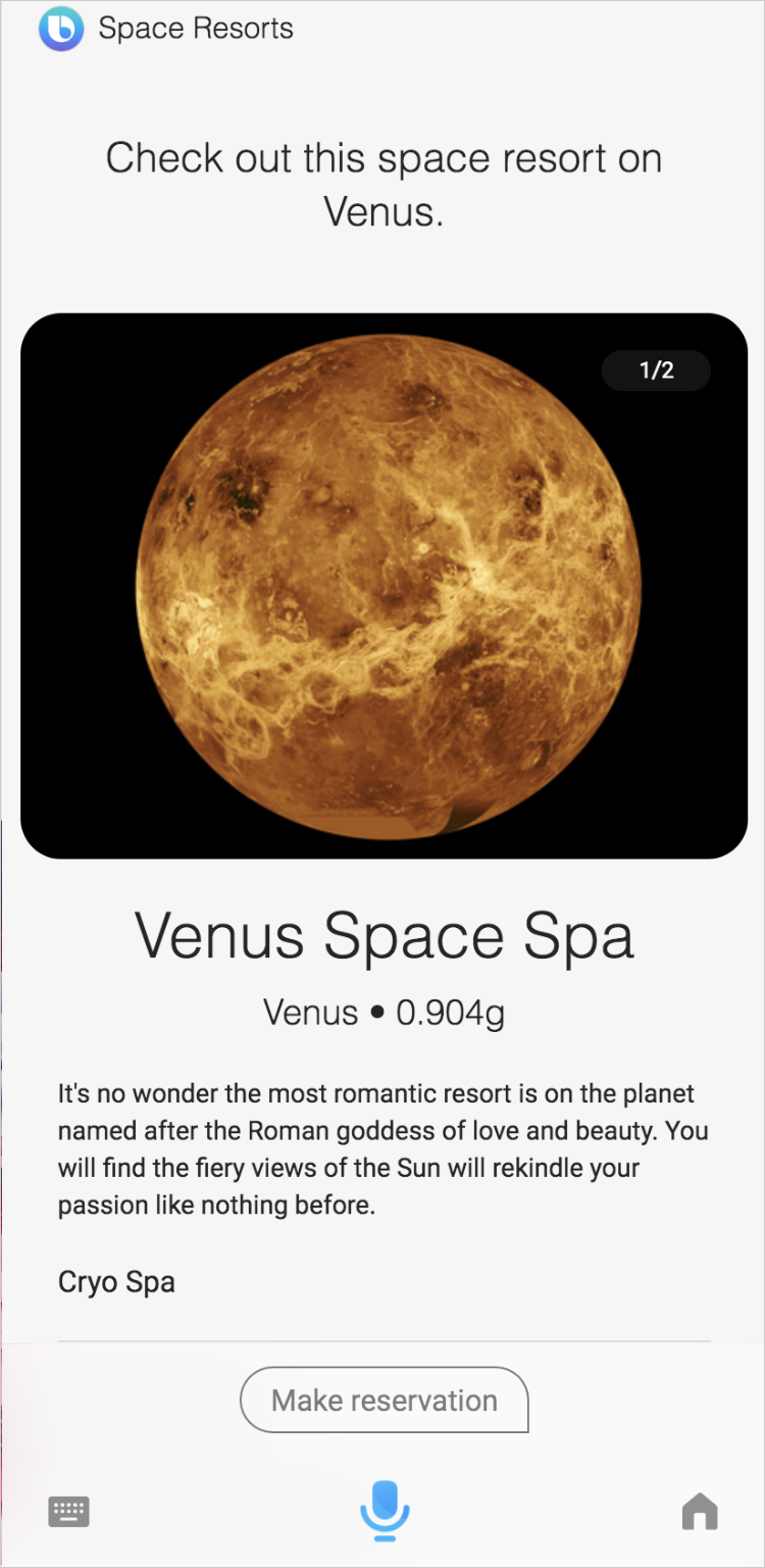
The view begins with a match block that specifies the concept this view is for. In this case, the view matches SpaceResort, and binds the value of the SpaceResort concept to result. See match patterns for more details.
The next block is render. A render block specifies the actual layout for the view in one of several ways:
- The layout can be defined right within the view in a
layoutblock. That's what this example does. - The layout can be imported from a separate file with
layout-match. - A layout macro can be imported from a separate file with
macro. This is used twice in the result view above, matching macros defined withmacro-def (space-resort-image-carousel)andmacro-def (space-resort-details)in other layout files.
What's the difference between layout-match and macros? They both include external files in your layout, but macros allow you to pass parameters from the render block to the included layout macro. In the example above, both space-resort-image-carousel and space-resort-details take a spaceResort as their parameter. The result view above passes the value of result to the imported layout macros, which is set to the value of the matched SpaceResort concept. Each layout macro nested within layout is defined with section as its top level component. However, you could define several section keys within a single macro file instead.
This view also includes a conversation driver, explained in more detail later in this document.
Conditional Blocks
Layouts can use if-else statements to render elements only when specific conditions are met.
content {
  if (value == 1) {
    paragraph { ... }
  else-if (value == 2) {
    paragraph { ... }
  else {
    paragraph { ... }
  }
}
You could use conditional blocks within a single-line element to indicate whether a movie had received mostly good or bad reviews. Assume that a 60% or higher score indicates a good rating:
single-line {
  text {
    value ("Rating:")
    style (Detail_M)
  }
  spacer
  if (score < 60) {
    image {
      url (thumbs-down.png)
    }
  }
  else {
    image {
      url (thumbs-up.png)
    }
  }
}
Here is a more complex example, which shows a different number of star images in a single-line, depending on the rating of the hotel:
    single-line {
      if (rating == 0) {
        text {
          value ("0 stars")
        }
      } else-if (rating <= 0.5) {
        image {
          url ("/images/icons/half-rating.png")
          style (Detail_M)
        }
      } else-if (rating <= 1.0) {
        image {
          url ("/images/icons/rating.png")
          style (Detail_M)
        }
      } else-if (rating <= 1.5) {
        image {
          url ("/images/icons/rating.png")
          style (Detail_M)
        }
        image {
          url ("/images/icons/half-rating.png")
          style (Detail_M)
        }
      } else-if (rating <= 2.0) {
        image {
          url ("/images/icons/rating.png")
          style (Detail_M)
        }
        image {
          url ("/images/icons/rating.png")
          style (Detail_M)
        }
      } else-if (rating <= 2.5) {
        image {
          url ("/images/icons/rating.png")
          style (Detail_M)
        }
        image {
          url ("/images/icons/rating.png")
          style (Detail_M)
        }
        image {
          url ("/images/icons/half-rating.png")
          style (Detail_M)
        }
      } else-if (rating <= 3.0) {
        image {
          url ("/images/icons/rating.png")
          style (Detail_M)
        }
        image {
          url ("/images/icons/rating.png")
          style (Detail_M)
        }
        image {
          url ("/images/icons/rating.png")
          style (Detail_M)
        }
      } else-if (rating <= 3.5) {
        image {
          url ("/images/icons/rating.png")
          style (Detail_M)
        }
        image {
          url ("/images/icons/rating.png")
          style (Detail_M)
        }
        image {
          url ("/images/icons/rating.png")
          style (Detail_M)
        }
        image {
          url ("/images/icons/half-rating.png")
          style (Detail_M)
        }
      } else-if (rating <= 4.0) {
        image {
          url ("/images/icons/rating.png")
          style (Detail_M)
        }
        image {
          url ("/images/icons/rating.png")
          style (Detail_M)
        }
        image {
          url ("/images/icons/rating.png")
          style (Detail_M)
        }
        image {
          url ("/images/icons/rating.png")
          style (Detail_M)
        }
      } else-if (rating <= 4.5) {
        image {
          url ("/images/icons/rating.png")
          style (Detail_M)
        }
        image {
          url ("/images/icons/rating.png")
          style (Detail_M)
        }
        image {
          url ("/images/icons/rating.png")
          style (Detail_M)
        }
        image {
          url ("/images/icons/rating.png")
          style (Detail_M)
        }
        image {
          url ("/images/icons/half-rating.png")
          style (Detail_M)
        }
      } else-if (rating <= 5.0) {
        image {
          url ("/images/icons/rating.png")
          style (Detail_M)
        }
        image {
          url ("/images/icons/rating.png")
          style (Detail_M)
        }
        image {
          url ("/images/icons/rating.png")
          style (Detail_M)
        }
        image {
          url ("/images/icons/rating.png")
          style (Detail_M)
        }
        image {
          url ("/images/icons/rating.png")
          style (Detail_M)
        }
      } else {
        text {
          value ("No Rating")
        }
      }
For more information on control flows, see the conditionals reference topic.
Loop Blocks (Lists)
There are three structures for looping:
list-oftakes an expression in aresult-viewand creates a list from it, which can be iterated over withwhere-each.selection-offunctions similarly tolist-of, but generates a selection picker for users to select items from a given list.for-eachis used within layouts (not views) to loop through an array. This is frequently used withinpartitionedcomponents.
          partitioned {
            content {
              for-each (hotel.amenities) {
                as (amenity) {
                  single-line {
                    text  {
                      value ("#{value(amenity)}")
                      style (Detail_L)
                    }
                  }
                }
              }
            }
          }
Layout Modes
When using layout-match (not layout-macro or macro), the same file can actually contain more than one layout matched on the same value. Bixby can choose between them based on the mode key.
A view file could look like this:
result-view {
  match: Flower (flower) {
    from-output: ShowFlowerCompoundCards
  }

  message {
    template ("Here are flowers as compound cards:")
  }

  render {
    if (size(flower) > 1) {
      list-of (flower) {
        where-each (item) {
          macro (flower-compound-card) {
            param (flower) {
              expression (item)
            }
          }
        }
      }
    }
    else-if (size(flower) == 1) {
      layout-match (flower) {
        mode (Details)
      }
    }
  }

  conversation-drivers {
    conversation-driver {
      template ("Show flowers as image cards")
    }
    conversation-driver {
      template ("Show flowers as thumbnail cards")
    }
    conversation-driver {
      template ("Show flowers as compound cards")
    }
  }
}
Instead of this approach, you could have two separate macro files and pass a parameter to them. The actual sample Space Resorts capsule takes this approach, invoking macro-def (space-resort-details) and macro-def (space-resort-summary). The choice is yours.
A single result (Details mode) might be rendered like this:
While multiple results (Summary mode) might be rendered like this:
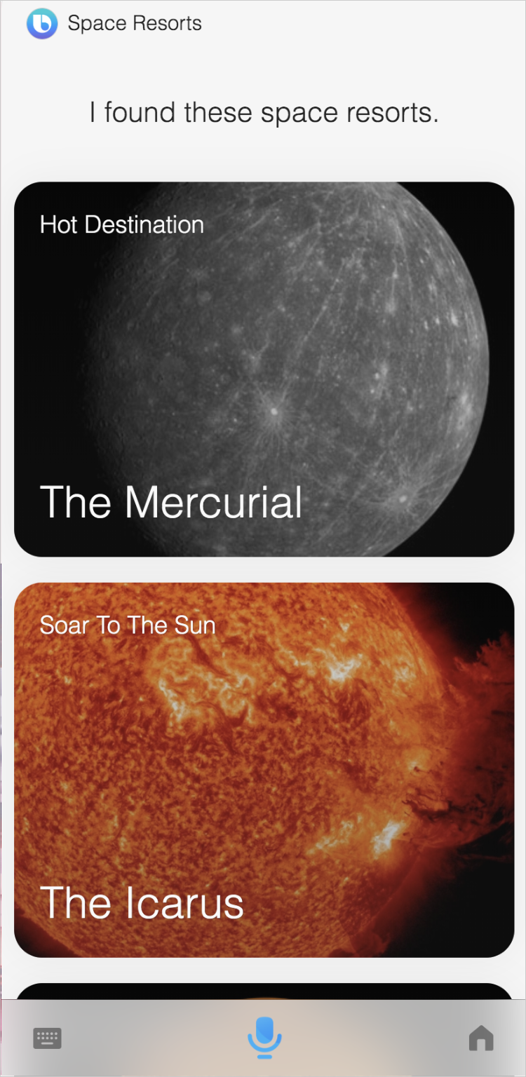
The following layout modes are supported:
Summary(for a list in a result view)Details(for a single item in a result view)Confirmation(for confirmation views)
Targets and Localization
When designing layouts, you should consider the various targets your capsule supports. In general, you should keep your layouts consistent, no matter your target. Targets render by default from the base layout directory, as explained in the Organize Your Capsule Resources Developers' Guide.
However, if you are supporting multiple targets, your views might need to differ depending on what information needs to be displayed on the target screen. We recommend that you start with one device and one locale, then expand to different targets. You should take advantage of macros as needed, so you don't have to repeat content. Use the Simulator to determine if you should create a target-specific customization for some layouts. For example, if you are developing a capsule for mobile and watch devices in the US and Korea, make sure you test the bixby-mobile-en-US, bixby-mobile-ko-KR, bixby-watch-en-US, and bixby-watch-ko-KR targets.
For example, a phrase in English might take several words that span two lines, while the Korean equivalent has fewer characters and only needs a single line. For that particular layout, you could create a separate layout file in that resource folder. However, you do not need to create separate layouts for every single item that needs translating, so consider each layout on a case-by-case basis. For more information on localization, see the Localizing Capsules Developers' Guide.
If your targets span multiple devices, you should not need to do anything different besides ensuring that the target is properly declared in the capsule.bxb file. Bixby automatically handles the formatting changes between devices. However, keep in mind that the look and feel of various components might differ between devices, especially due to screen limitations of a device. Read the Checklist for Multiple Devices guide and the reference pages of the various components for more information.
Similar to supporting different languages, you could also use device-based layout customization to override your views in the base directory. We recommend this if you have different views for different devices. However, if you only have one small difference in a view between devices, you can use the special EL variable $can.device and conditionals to differentiate between devices within that view, like in the following example:
result-view {
  ...
  render{
      if ($can.device == 'bixby-watch') {
    ....
    }
    else {
      ...
    }
  }
}
Conversation Drivers
Imagine that you have a capsule that provides restaurant results.
When users search for nearby pizza places, your capsule could show a list with results. However, you could also provide a "View map" button at the bottom, allowing users to quickly see the results on a map. If the user selects a specific restaurant, the capsule could then provide buttons in a similar fashion to reserve a spot at the restaurant or get directions to the place.
To offer users convenient shortcuts to related actions like this, you can use Conversation Drivers.
You add Conversation Drivers to views using the conversation-drivers parent key. In this example that allows users to look at space resorts, the conversation driver provides a quick way for the user to make a reservation at that resort:
result-view {
  // This view is used to show the SpaceResort details when the user select a space resort from a summary list. This follows the design paradigm to go from Summary to Details
  match {
    SpaceResort (result)
  }

  render {
    // We know the size is always 1 because this view is only attainable when drilling into a single item to see the details
    // Lists of space resorts are handled in the ViewAll_Result and Input files
    if (size(result) == 1) {
      layout {
        macro (space-resort-details) {
          param (spaceResort) {
            expression (result)
          }
        }
      }
    }
  }

  conversation-drivers {
    if ("size(result) == 1") {
      conversation-driver {
        macro (MakeReservation)
      }
    }
  }
}The resulting "Make reservation" button appears at the bottom of the screen:

When users select this button, Bixby effectively runs a new utterance using the new template text.
For more information, see Conversation Drivers in the Guiding Conversations Developers' Guide.
Video Tutorial: Using Conversation Drivers to Enhance User Experiences
The following video tutorial describes conversation drivers and how to use them to increase engagement with users.
Property Projections
Users often have more nuanced utterances that involve not just a thing, but the properties of that thing. For example, a user looking for a specific hotel might actually be looking for the address of that hotel. So if the user asks, "Get me the address for the Marriott in San Francisco," you can use property projections to extract only the address of Marriott hotels:
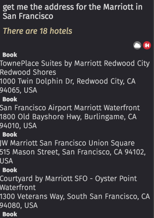
The displayed summary layout focuses just on the property the user requested, the addresses of hotels that match the search criteria of "Marriott" and "San Francisco".
Maps
If your capsule involves locations, addresses, or other geo-spatial properties, you can use use a result-view to embed a map in your view with a map-card.
Highlights
Highlights allow you to filter, sort, label, and present results based on criteria that you determine.
If you want Bixby to automatically determine your highlights, you can simply
present an empty highlights container.
If you want to determine your own highlights, you need to consider what makes the most sense in your specific use case.
Bixby only displays up to three highlights, depending on which ones return a result first and if there are at least four or more results to display.
Here is an example for finding hotels that allows Bixby to choose among four options based on a number of criteria, such as promotional rate or highest user rating:
result-view {

  match: AvailableHotel (this)

  render {
    if (size (this) == 1) {
      layout-match (this) {
        mode (Details)
      }
    } else {
      list-of (this) {
        ...
      }
    }
  }
}
For details, read about highlights in reference documentation.
Supported Image Types
In layouts, the image types supported are determined by the underlying web client. Most image types can be used, including JPG, PNG, GIF, and SVG. However, we recommend you use PNG and JPG, as these are guaranteed to be supported in all display devices.