Input Component Patterns
The design specifications for these components should only be used with Input Moments in Input Views.
In addition to the components listed, you can also use the universal components to further organize and format your information.
You can learn more about the components used in the different ways to gather information from users in the linked sections:
Selection Components, when choosing from a finite list of choices.
Elicitation Components, when information cannot be easily selected or picked.
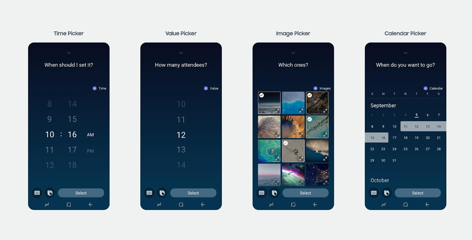
Picker Components, when information is from a known set and you want to keep the formatting consistent like date, time, image, or values.
If your component contains an image, be aware of the contrast both in light mode and dark mode. For examples on optimizing between these modes and information on how to implement different images for different modes, see the Theme Support sample capsule.
Selection Components
If you need to ask a user to select an item from a list, use a selection layout. This is similar to using a list to display results in a Result moment.
Selection layouts are made using the selection-of key in the input view. Within this list, you should use one of the pre-set components to display each item, most notably cards.
These pre-set components are advantageous because they allow you to display information without having to worry about spacing between the components or which groups of components go well together.
You can use any of these cards in your selection list:
The following comparison table shows some side-by-side examples.
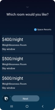
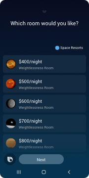
| Title Card | Cell Card | Compound Card |
|---|---|---|
 |  |  |
Title Cards
You can use title cards for input lists when presenting simple text. This is the most commonly used component for listing items out in a selection layout, and is useful because it allows users to quickly scan the options on the screen. Additionally, this component has more flexibility in terms of of style and number of lines than a cell card.
Cell Cards
You can also use cell cards for input lists. You should use these when you want to list a short amount of text information and optionally add a supplemental image like an avatar. The text displays the first two lines in a cell card.
Thumbnail Cards
You can also use thumbnail cards for input lists. If your product image is supplemental information or images are not the top priority, thumbnail cards are the best formatting components. Use case examples include news headlines, sports teams highlights, or TV channels with logos. You can also use lower-resolution images that are often provided by users. The thumbnail image has different ratio options you can try in the interactive demo.
Compound Cards
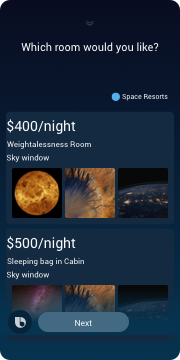
You can use compound cards for input lists when one of the pre-formatted cards won't fit your information design.
To complete your custom card, you can use the following components:
dividerhbox(andvboxinside multiplehboxcomponents)imageimage-listparagraphsingle-linetitle-areathumbnail-cardwithout anon-clickvideo
Image Cards
You can use image cards when the image contains priority information required for the user to make a decision. You can achieve greater visual impact with high-resolution dynamic images. Because you are displaying multiple options in this first view, image cards should only be used when the large image shows the most important information that might affect a user's decision.
Elicitation Components
For certain situations, you can use the selection components as well as the auto-complete component, which presents a search field with completion suggestions from a given list.
Picker Components
There are a variety of pre-formatted picker components you can use to gather information from a user within an input view.
date-picker: lets users select a datetime-picker: lets users select a timecalendar: lets users select a date or date range from a calendarimage-picker: lets users select one or more imagesform: generates a view with editable fields for users to input information
